No comic is more popular in my household than the “Dog Man” books by Dav Pilkey. (Well, at least that’s what my sister and I think.) We’ve read “Dog Man” since the 4th grade and loved it. The deep, moral questions hidden by potty humor entertained us and many other kids our age.
One thing that always stood out to me was the art style of “Dog Man.” Most of the books I’d read at the time had complex details and biblically accurate proportions, but “Dog Man” looked like a little kid drew it.
When the “Dog Man” movie was released on Dec. 31, 2024, my sister and I were worried about how the traditional art style would translate on screen. Especially with the “Minecraft” movie’s release looming ahead, we thought that the characters might been rendered hyper-realistic and would thus lose the beauty of the cartoon element, similar to how the “Minecraft” movie has forebode. We thought they might make everything realistic and therefore lose the special element of its childlike art style, but luckily, we were wrong.
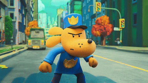
The first thing I noticed about “Dog Man” was their consistent skipping of every few frames in the animation. While this sounds like a weird idea, it in fact really made the animation look like moving comic frames. Despite this, the action was still easy to see and understand, as displayed in the GIF below:
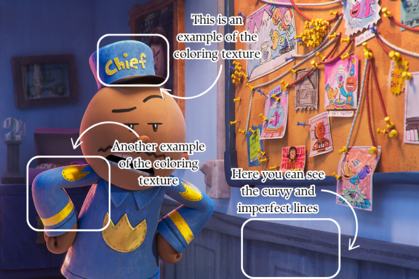
Along with this, every surface in “Dog Man” had the appearance of being hand-textured. When modeling 3D objects and characters, the texture is what dictates some of the level of realism each model will have. Some textures can be hyper realistic and detailed or can be very basic and smooth. 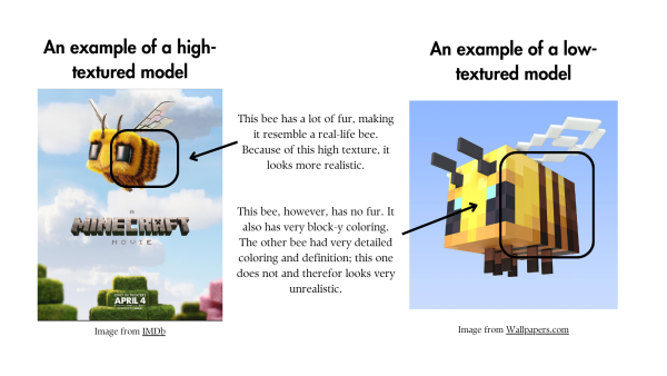
Image on left , image on right Graphic made on Canva by Kitty Alexander
“Dog Man” created a texture that looks like the animators refused to use the fill button and instead colored in the textures the same as someone coloring a coloring book, something that is very similar to the “Dog Man” books.
Combined with the characteristic unsophisticated textures of the “Dog Man” movie models and the skipping animation frames, the movie presented itself as a very comic book-y movie. However, something that was unexpected to me was how the superb lighting gave everything a breath of life.
Every single scene had beautiful lighting in bright and contrasting colors, adding more depth and realism to the models. As shown in the graphic below, this lighting technique bends the level of cartoon appearance in the “Dog Man” movie.
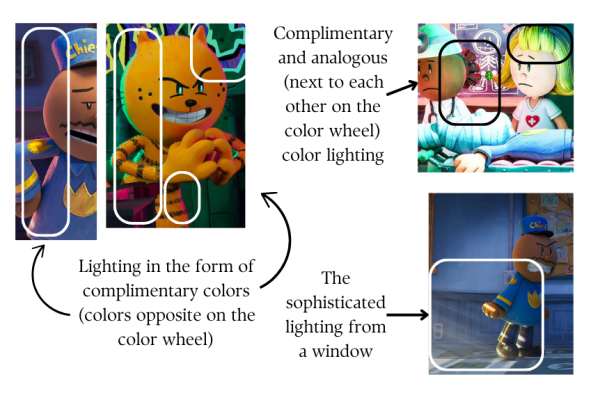
The contrast of cartoonish models and genuine lighting is an effect that really speaks to the comic book style. Having the base of what the audience is seeing be almost pencil line to pencil line exactly what is drawn in the books while also adding this element of realism and exaggeration of textured lighting is an utterly fabulous depiction of the “Dog Man” style. Because of this, the style of the “Dog Man” movie matched the comic books pretty well. All in all, the animation of the “Dog Man” movie was dogon good, ‘cerealisly.’